

Created with Sketch.
Created with Sketch.
Creating a new identity for a tech brand rooted in New York City.
Squarespace is one of very few technology companies that can truly call NYC home. The city has inspired our attitude, our aesthetic, and our mission to democratize good design for every ambitious entrepreneur, artist, or visionary with a dream. As we began to rethink our brand identity, we knew we needed to find a way to make New York a bigger part of the story.

“New York has always been
in the DNA of Squarespace.”
David Lee, Squarespace
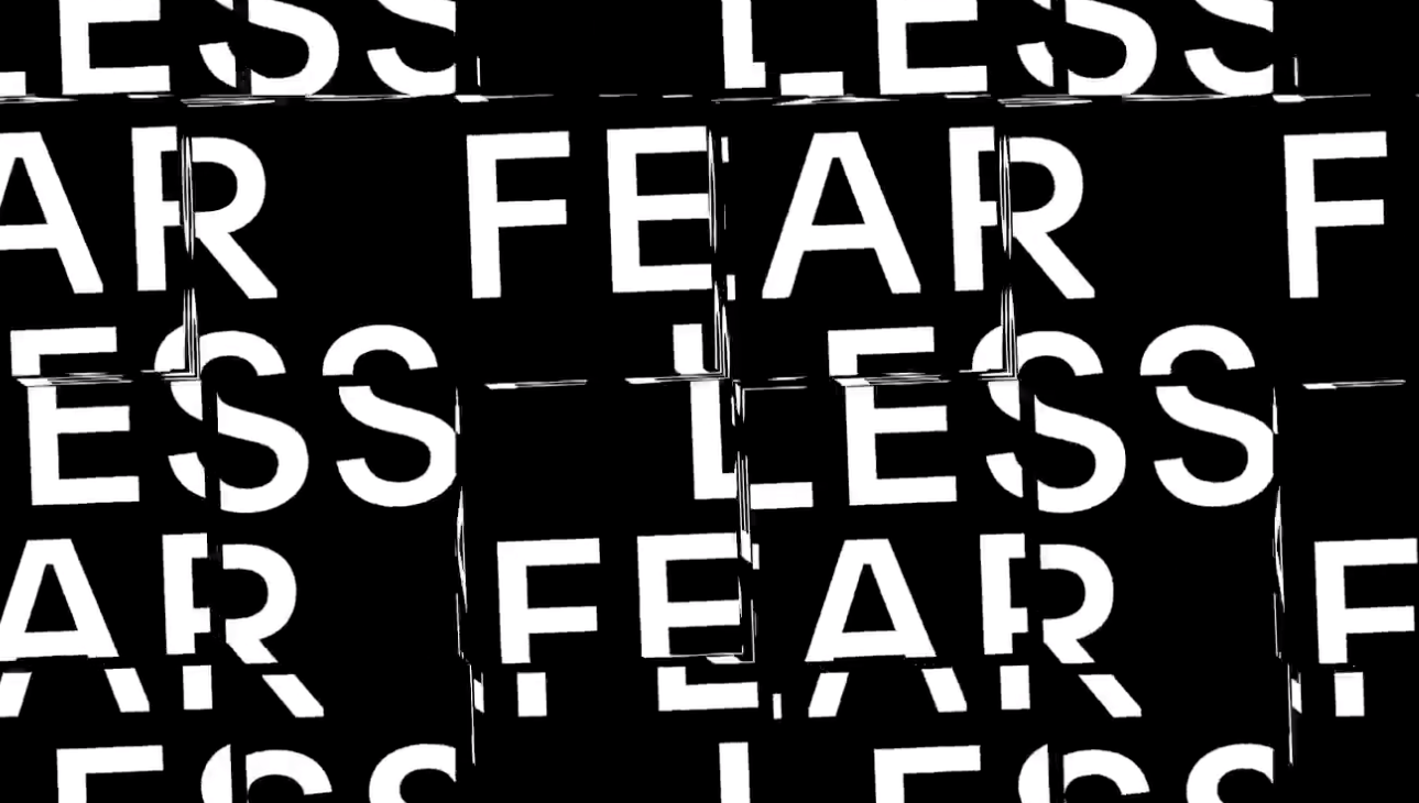
Communicating attitude through typography.
The essence of New York is sophistication with an edge. It shows up in the architecture, the fashion, and the art that’s created here, as well as in the personalities of the people who make this city their home. The tension between those two ideas is expressed in the design of our headquarters at 8 Clarkson Street, and it was equally important to bring it into our typography.

We worked with DIA Studio, François Rappo, and Optimo, to create an entirely new brand typeface, that’s intentionally idiosyncratic, balancing the clarity and sophistication of a neo-grotesque sans serif with the edge formed by thoughtfully cutting the letterforms. Slightly left of center, it perfectly communicates our New York heritage. Meet Clarkson.

Giving meaning to our name.
New York is a study in movement; like jazz, it constantly heads in unpredictable directions. Since much of our output is interactive and screen based, we knew the brand needed to make sense in motion. So we developed a kinetic identity system that dimensionalizes our name and reinforces the two syllables in Squarespace.
“This system allows designers
to improvise and create infinite
variations while always maintaining
a consistent visual thread.”
Mitch Paone, DIA
Designing for unpredictability.
Trial and error was an integral part of the design process—and of the resulting system. Much of the image-making is handled by a generative system that introduces happy accidents and unexpected collisions into the compositions. It also ensures that the system will remain continually fresh and grow beyond the initial guidelines into a robust, extensible visual language that works across marketing, social, product, and our website.
“I imagined for the font
design the best balance of key values:
objectivity, visual clarity—with a
playful touch and signature.”
François Rappo
Celebrating where we come from.
What does it mean to be a technology company that’s three thousand miles away from Silicon Valley? For us, it’s the very core of our culture. New York has shaped the Squarespace brand in so many ways. With our new brand redesign, we acknowledge its inspiration directly.